
A Problem
When SCUBA divers are traveling to new places it can be difficult to find thorough and trustworthy information about places to dive online. Nomad Divers is for divers and travelers from around the world who want one platform to find and share reliable dive site information.
An Objective
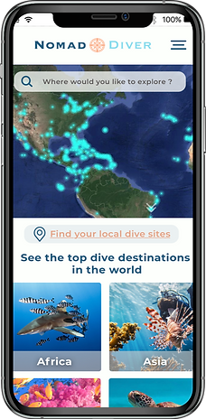
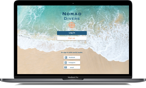
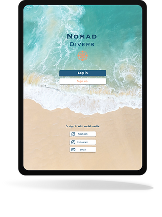
The objective was to create a location-based, responsive web app where users could find dive sites around the world or locally.
Providing users with current and useful information about the dive site and giving them the option to share their own information or experiences

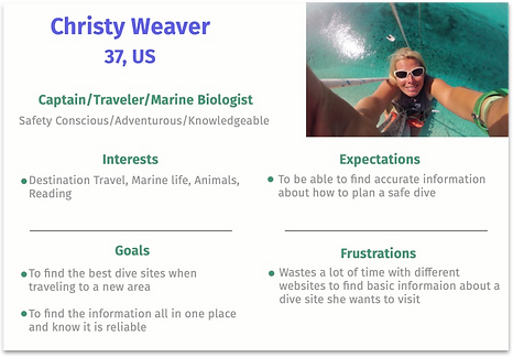
I conducted a competitor analysis on what type of information platforms are already available. I noted their strengths and what needs to be improved. During this process, I created some user personas to represent our most common potential user type.
User Personas
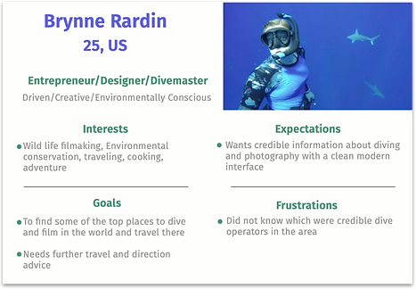
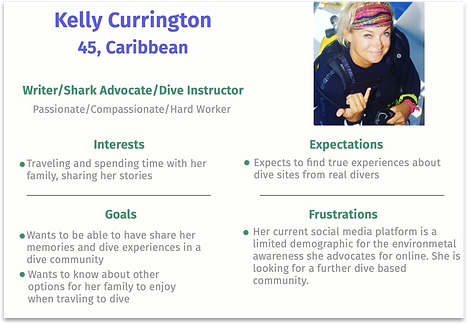
Creating a realistic representation of user behavior makes it possible to understand users' experiences and goals. A deeper understanding will help the design process and make sure this product meets their needs.
User Testing
The next step was to sketch up some low-fidelity screen wireframes. I conducted usability tests with this prototype. This process involved a detailed questionnaire and discussion with each participant while they navigated the early stages of the app.
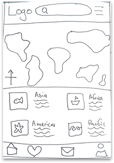
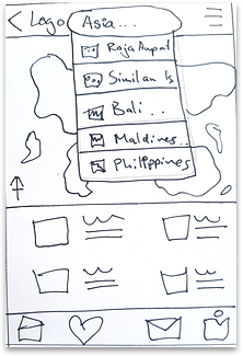
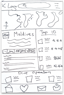

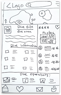


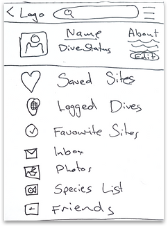
Useful information I took from the user interviews;
Divers would like to see:
-
Links to nearby facilities, not only dive related
-
The top local dive operators' information when looking into a dive site
-
Reviews and ranking of dive local operators, not just dive sites
-
More safety information so they can be prepared

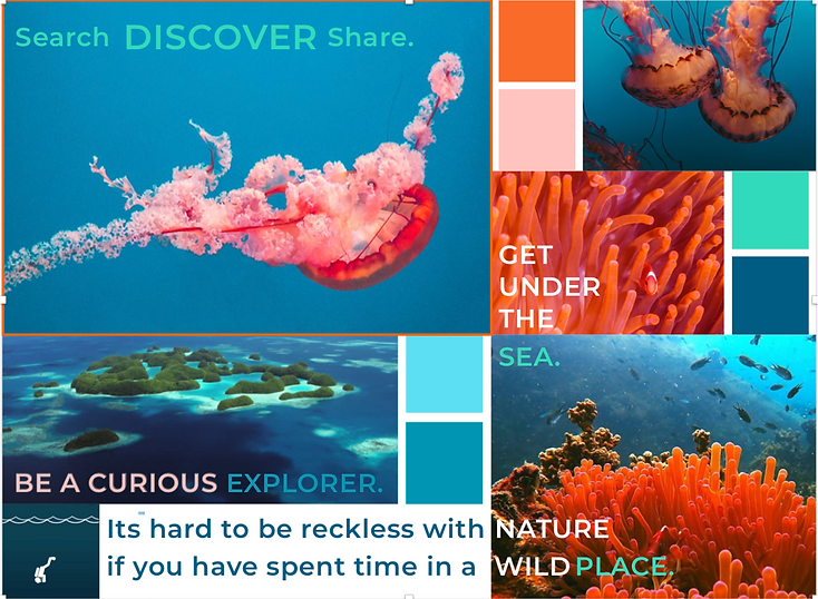
I then explored inspiration for the style of Nomad Divers.
I created a design direction that connected people with the ocean, nature and adventure.
I want to remind viewers of what can be discovered.
Style Guide
Colour Palette
I used some cool water colours to create a cohesive palette that flows. I added some warm oranges and pinks to complement these cooler tones.

Imagery
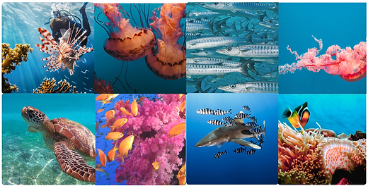
Images were used to showcase a dreamlike quality of being under the water, connecting the user with the experience they are searching for.
Images were used to showcase a dreamlike quality of being under the water, connecting the user with the experience they are searching for.
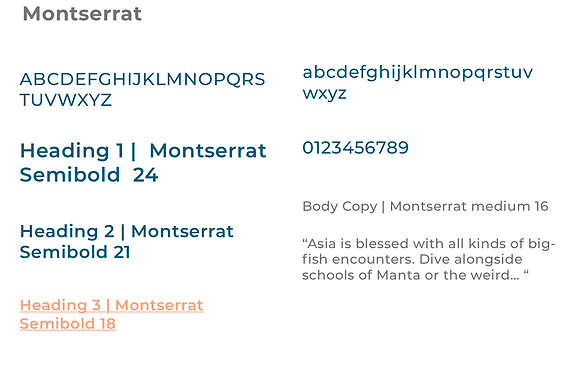
Typography
Iconography
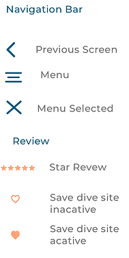
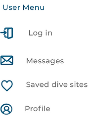
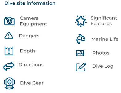
Icons are recognizable and simple. A playful and fun design is used, to create an enjoyable experience.
The user interface contains many icons, so keeping them as simple and intuitive as possible is important to avoid unnecessary confusion.


Conclusion
I had a lot of fun with his project. I prioritized the research into the market and the users, which was enjoyable and became incredibly beneficial to the success of the design.
My objective was to create a location-based web app for SCUBA divers and travelers to easily source reliable information about dive sites worldwide.
Once I had mapped out the screen layout, I spent time with potential users as they tested the prototype. The feedback from these interviews was very beneficial as I began to develop the layout and design. I am grateful for these insights and in the future, I will seek user participants earlier and more often throughout the entire design process.
Something I would have done differently would be to map out the user flow more clearly before I begin low-fidelity wireframes. I think prioritizing this step in the future will simplify the process and will be a more efficient use of time.
I have achieved the users objectives I am pleased with the design and layout function of Nomad Divers


