Overview
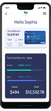
Bloom is a simple and safe way for users to track their cash flow, credit usage, cryptocurrencies, and financial goals in one convenient digital wallet.
Bloom is a responsive app, designed to use conveniently on the go. You can see and adjust your spending and savings on your mobile, tablet or laptop.
My Role
UI Designer
Creating User flow
Creating Wireframes
Incorporating Feedback
Creating Style and Icons
Problem
Saving money can be really hard, especially when you don't have a long time to do so. It is easy to feel overwhelmed by your finances when trying to judge what is and is not possible and how to make the most of your money flow.
User Objectives
See a dashboard of their finances clearly and visually, so that they can see how much they are spending on what at a glance.
Input information on the money they are receiving and spending (and on what), so that they can see an overview of their finances.
Create a profile, so that the financial advice they receive is personalized to them, their spending habits, and tailored to their goals.
User Flow
User Flow
I created a user flow based on the user objectives to visually start plotting the flow of the screens

Low Fidelity Screens
�
Taking the use flow screen plan and adapting them into low fidelity screen sketches I could start to develop a sense of what the app will look like


Mid Fidelity Screens
I developed the screens into a basic digital version to analyze the logistics of the app more accurately.
During this process, I also sought user feedback.
I had 4 participants trial the mid-fidelity prototypes.
Their feedback was valued and these changes were applied to the screens as they were developed further.


"The text size is a bit small when inputting personal data during the create account process."

"When connecting Banks.
I think it would be more efficient to have the search bar at the top of the screen instead of at the bottom. Possibly a drop-down menu.."

"The user may need an option to go back to the bank choice screen if they have chosen the wrong bank "

"There could be an animation here to keep the user interested while they wait"
"It would be good if the user could group the type of savings goal into a category, so they could see savings on a bigger picture"
"The nav bar could have an indicator to show clearly when the user is moving from screen to screen. This would highlight where the user is and will eliminate any confusion"


"It might be helpful for the user to have a burger menu option once they have reached the profile screen"
"The user may need to display more than one credit total as different accounts and totals may apply"
High Fidelity Screens
Using what I had learned from the feedback process expanded on the digital screens in more detail, adding colors, typography, graphs, and imaging.

Conclusion
My objective was to design a simple and safe way for users to track their cash. I created a responsive app, designed to use conveniently on the go.
Once I had finalized specific user objectives I created a user flow so I could start to map out the screen design and plan. After digitizing these wireframes I had participants take a look at the prototype and provide feedback. During this process, I gained a much better understanding of what users need and how they use each screen. I simplified the design and added extra details to make it more convenient for the user. This user feedback was invaluable.
Next time I would spend more time conducting a competitor analysis and try to acquire a greater appreciation for the user personas so I get a better idea of the market
Overall, I am pleased with the design style and layout of the app and I have achieved the user's objectives.


